
A mobile-friendly website is a site that loads quickly, adapts cleanly to small screens, keeps text readable, makes navigation easy with touch, and lets visitors take action without pinching, zooming, or fighting the layout. For most businesses, mobile-friendly design is no longer a nice extra. It is the default way customers, search engines, and prospects experience the brand.
The original reason to build a mobile-friendly website was simple device compatibility. Today the business case is bigger: mobile traffic, search visibility, user experience, conversion, and trust all depend on how well the site works on phones. A desktop-first website can still look acceptable in a boardroom and fail where buyers actually discover, compare, and contact you.
If your website supports lead generation, booking, ecommerce, customer support, or a product workflow, mobile readiness should be part of the wider web app development plan. The strongest results come when design, frontend performance, content structure, forms, analytics, and technical SEO are treated together.
Quick Answer: Why Do You Need A Mobile-Friendly Website?
You need a mobile-friendly website because many visitors arrive from phones, Google evaluates pages with mobile-first signals, users abandon slow or hard-to-use layouts, local and service buyers often act immediately, and a poor mobile experience makes the business look outdated. A mobile-ready site helps people read, compare, contact, book, buy, or request a quote with less friction.
A mobile-friendly site does not only shrink a desktop page. It prioritizes the tasks mobile users are trying to complete: scanning the offer, checking proof, finding pricing or availability, tapping a phone number, submitting a short form, opening directions, reading a guide, or saving information for later.
What Makes A Website Mobile-Friendly?
A mobile-friendly website combines responsive layout, fast loading, readable content, touch-friendly navigation, stable design, accessible forms, and clear calls to action. The page should feel intentional on a phone, not merely squeezed into one column.
For CMS-led sites, responsive WordPress themes can provide a starting point, but theme responsiveness is not the same as a high-performing mobile experience. Teams still need to test page speed, tap targets, image sizes, form usability, menu depth, and how the content reads on real devices.
- Fast loading: compress images, reduce unused scripts, improve hosting, and prioritize above-the-fold content.
- Readable typography: use legible font sizes, comfortable line height, strong contrast, and short paragraphs.
- Touch-friendly navigation: make menus, buttons, filters, and form controls easy to tap without mistakes.
- Stable responsive layout: avoid elements that jump, overlap, overflow, or hide important content on small screens.
- Focused CTAs: make the next action obvious, whether that is calling, booking, buying, downloading, or requesting a quote.
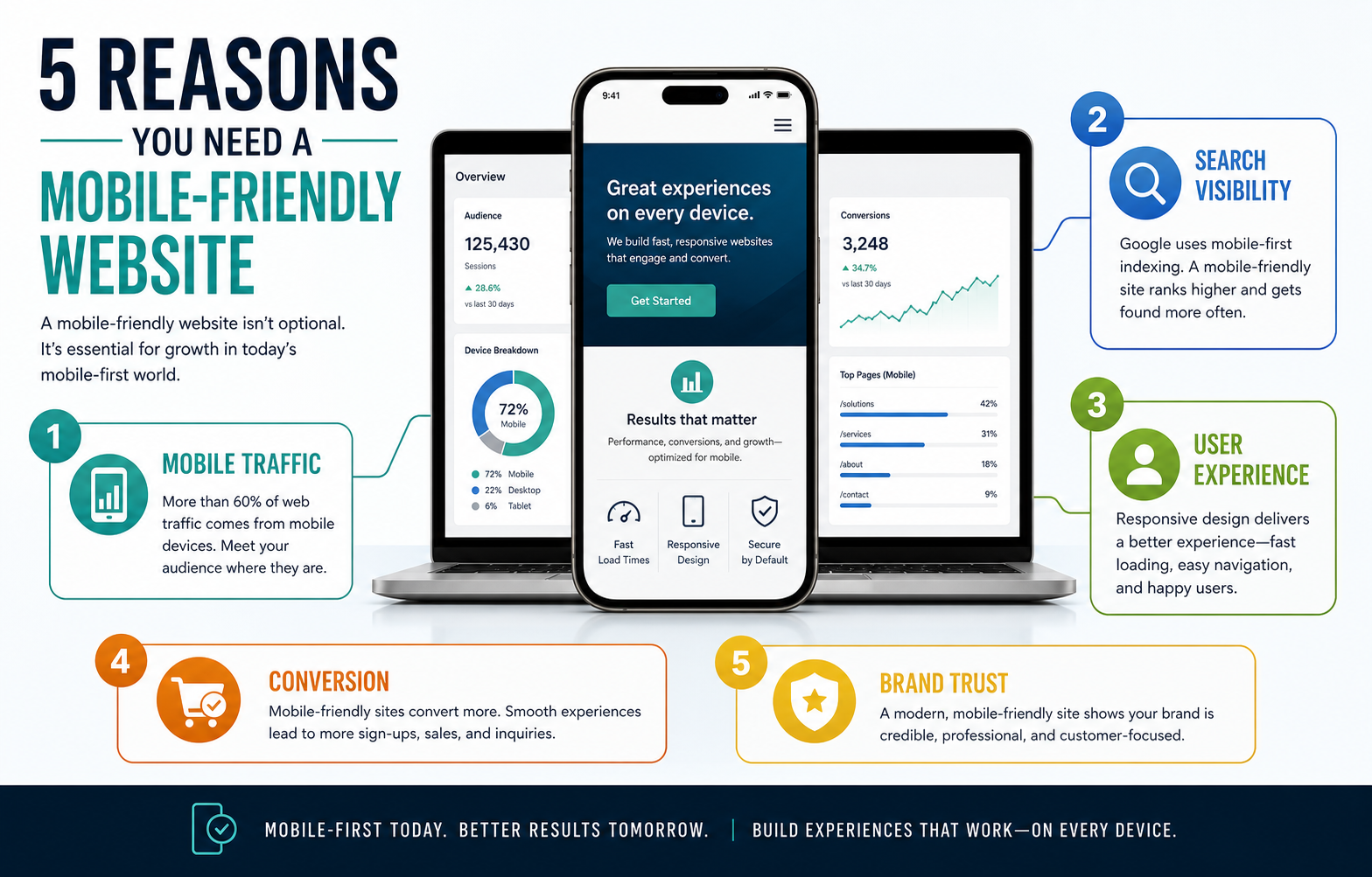
5 Reasons You Need A Mobile-Friendly Website
The five reasons below are connected. More mobile traffic increases the importance of mobile SEO. Better mobile usability improves engagement. Engagement and trust improve conversion. Conversion makes the website more useful as a business asset.
1. Mobile Traffic Keeps Growing
Customers use phones to search, compare, read reviews, check services, open maps, contact businesses, and make purchases. Even when a final decision happens later on a laptop, the first impression often happens on a phone. If that first visit is slow, cramped, or confusing, many people do not return.
This matters for both local businesses and digital products. A visitor may only have a few seconds between meetings, while commuting, or while comparing vendors. The mobile page needs to communicate the offer quickly and make the next step easy.
2. Google Uses Mobile-First Signals
Search engines need to understand the version of the page most users will see. Mobile-first indexing means your mobile content, structure, and usability can influence how reliably the page is crawled, interpreted, and ranked. If content is hidden, slow, unstable, or hard to navigate on phones, SEO performance can suffer.
A mobile-friendly website still needs the fundamentals: clear metadata, crawlable links, useful headings, schema where appropriate, strong content, and fast rendering. Use the SEO checklist for websites to review the technical and content items that responsive design alone cannot solve.
3. Mobile User Experience Builds Or Breaks Trust
Mobile visitors judge credibility quickly. Tiny text, popups that cover content, broken menus, overlapping sections, slow images, and hard-to-complete forms create doubt. A polished mobile experience signals that the business pays attention to details and respects the user's time.
Trust is especially important for services that require a quote, consultation, booking, payment, or account creation. The user may not know your internal team, technology stack, or delivery process yet. They judge the business by what the website makes easy or difficult.
4. Mobile Users Are Action-Oriented
Phone visitors often have immediate intent. They want to call, compare plans, check availability, save a resource, ask a question, or complete a short task. A mobile-friendly website should bring the action close to the content that creates intent instead of burying it at the bottom of a long page.
The same product thinking applies when deciding between a website, web app, or mobile app. If the user workflow depends on notifications, offline access, camera capture, background location, or app-store distribution, compare the website path with mobile app development and the tradeoffs in native vs cross-platform mobile app development.
5. Mobile Conversions Affect Revenue
A mobile-friendly website can improve revenue because it reduces friction in the moments that matter: inquiry forms, product pages, checkout, booking, calls, downloads, and consultation requests. Faster pages and clearer CTAs can turn more existing traffic into leads or sales before the business spends more on ads or content.
Conversion gains are not only about button color. They come from message clarity, proof, page speed, form length, trust signals, mobile payment behavior, and whether the page answers the buyer's next question at the right time.
Mobile-Friendly Website Readiness Scorecard
Use this scorecard before deciding whether to patch individual mobile issues or plan a broader redesign. Score each area from 0 to 5. A low total means the site likely needs more than a few responsive CSS fixes.
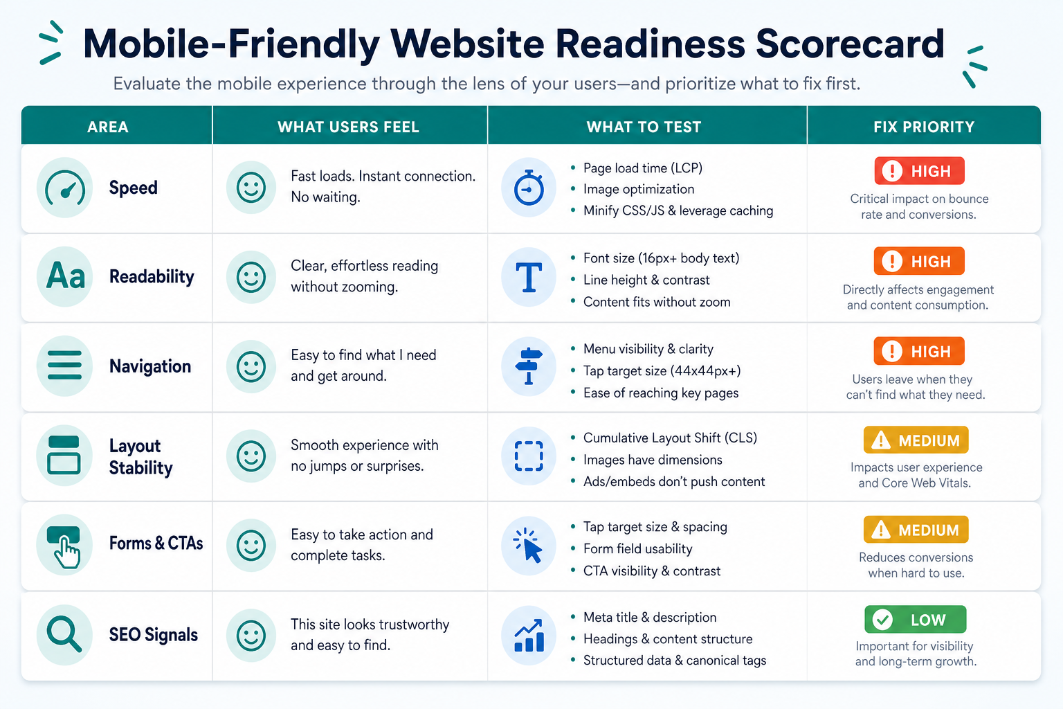
| Area | High-Value Signal | What To Test |
|---|---|---|
| Speed | The page becomes usable quickly on mobile data | Core Web Vitals, image weight, script cost, server response |
| Readability | Users can scan content without zooming | Font size, contrast, line length, paragraph density |
| Navigation | Users can reach priority pages in a few taps | Menu depth, tap targets, sticky actions, search or filters |
| Forms And CTAs | Users can contact, book, buy, or request a quote easily | Field count, keyboard types, validation, button visibility |
| SEO Signals | Mobile content is crawlable and aligned with search intent | Headings, metadata, internal links, structured content |
If the mobile audit reveals a larger product or platform rebuild, use the Custom Software Cost Estimator to model how design, integrations, roles, security, and infrastructure choices affect scope.
Mobile Conversion Flow
A mobile-friendly website should guide visitors from search intent to action with as few avoidable interruptions as possible. Each step needs to answer a practical question: Is this the right page? Can I trust this company? What should I do next? How hard will the action be?
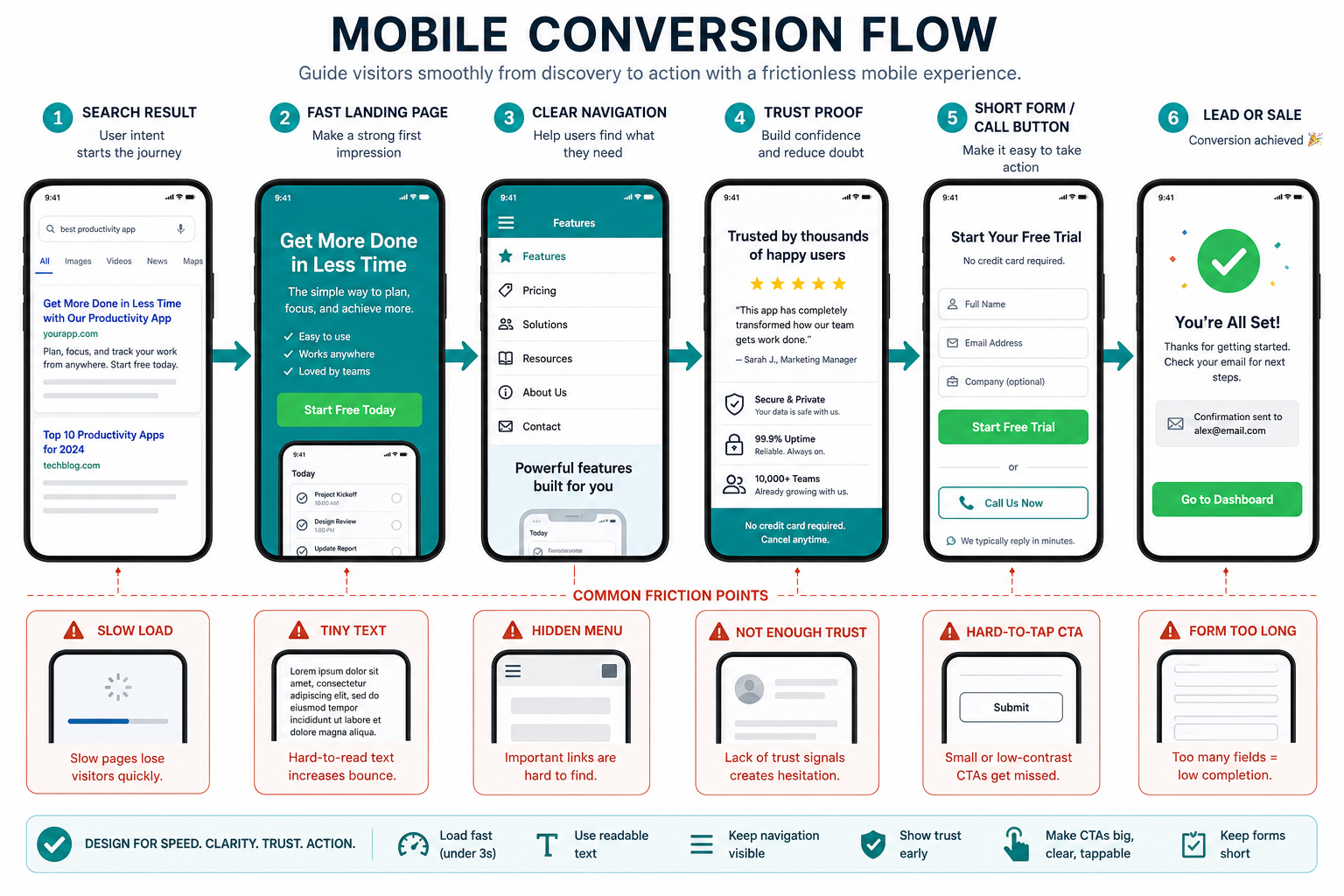
- Search result: title and description match the user's problem.
- Fast landing page: the page becomes useful before the visitor loses patience.
- Clear navigation: the user can find services, pricing, proof, contact, or product details.
- Trust proof: case studies, examples, testimonials, process notes, or credentials reduce uncertainty.
- Short action path: the form, call button, checkout, or booking step is easy on a phone.
How To Decide Whether To Fix Or Rebuild
Some mobile issues are simple fixes: oversized images, poor spacing, small buttons, missing viewport settings, or a slow third-party script. Other issues point to a deeper website revamp: outdated templates, confusing information architecture, weak CMS structure, inaccessible components, or a site that no longer reflects the offer.
Patch the current site when the structure is sound and the problems are isolated. Rebuild when mobile issues appear across most templates, the content model is holding back SEO, lead capture is fragile, or the website needs to support new services, tools, integrations, or product workflows.
Mobile-Friendly Implementation Checklist
Before publishing major mobile changes, test the real user journeys instead of relying only on a desktop browser's responsive preview.
- Test common devices: check iOS and Android screen sizes, not only one simulator width.
- Measure performance: compare Core Web Vitals, image sizes, script cost, and server response before and after.
- Review every template: homepage, services, blog posts, contact, portfolio, tool pages, checkout, and landing pages.
- Shorten forms: remove unnecessary fields and use the right mobile keyboards for phone, email, number, and date inputs.
- Check touch behavior: menus, dropdowns, filters, accordions, carousels, cookie notices, and sticky CTAs must be easy to dismiss or use.
- Track outcomes: monitor calls, form starts, form completions, scroll depth, conversions, and mobile search traffic after launch.
If the team is unsure which mobile improvements belong in the first release, the MVP Scope Builder can separate must-have mobile workflows from later refinements.
Final Recommendation
Build and maintain a mobile-friendly website because it affects how people discover, judge, use, and buy from your business. Mobile readiness improves search visibility, user experience, trust, conversion, and revenue when it is handled as a complete journey rather than a layout checkbox.
Start with the highest-impact pages and actions. Make them fast, readable, touch-friendly, trustworthy, and easy to complete. Then measure the results and keep improving the mobile path as customer behavior, search expectations, and business priorities change.